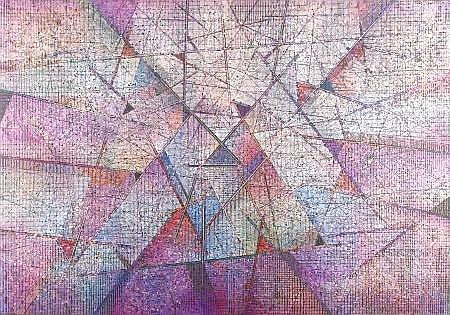
 This is a piece of art made by abstract artist Paul Maxwell. He used lines, shapes, and different shades of colors in his abstract art shown above. I really like the color theme of the artwork which is a white, purple texture. There are mostly triangles seen but if you look closer, it looks like there are small squares. I just like the overall design of this since the shapes are so small making it have plenty of detail.
0 Comments
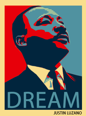
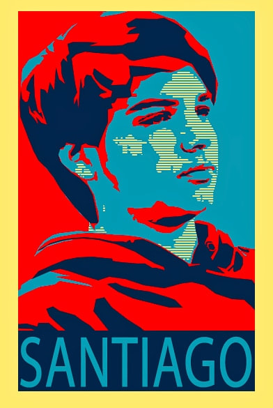
 This is a piece of artwork made by Shapard Fairey. This artwork is widely know around the U.S. because the "Hope" poster is known by many americans. The color choice on this artwork as well as the shades makes the work look professional and unique since there is nothing like this. This has inspired by brother Justin to create something very similar to this.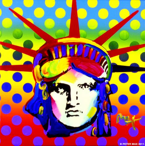 This is a piece of artwork made by Peter Max who creates colorful artworks and applies a unique background to each on of them. I really like the color choice on this artwork because it makes everything look alive instead of using a limited amount of colors. He took the time to make the artwork look more unique to viewers. This is another piece of artwork made by my brother Justin Luzano. As you can tell, he spent alot of time making this because he had to make triangles for all the pieces and color them differently in the artwork. I really like the caption he put and the structure of it. It shows alot of effort and shows appreciation towards me.
 This was an artork made by my twin brother Justin Luzano and he spend as much time on this as he did making his friend Santiago. I really like the choice of colors on this as well as the caption he made for the artwork. There are some spots where there could be more work but overall it's a good work of art.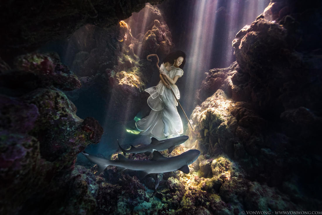 This was an artwork made by Benjamin Von Wong and his themes for the work he makes seems to be maniupulation. I really like how he made the woman in the scene seem underwater and the background consisting of sun rays in the coral reef. The light of the woman makes her stick out from the rest of the art as well as the sharks under her.
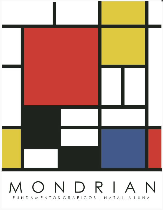 This artwork was made by Pete Mondrian who uses very basic colors and shapes in his artwork. The shapes in the artwork are all separated with black lines as well as has a black background. Simple rectangles with simple colors are scattered around the artwork in a specific pattern. I really like the simplicity of this artwork because it shows how the simple artwork can be considered creative.
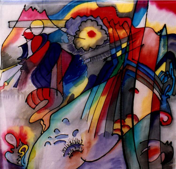 This is a piece of abstract art made by Wassily Kandinsky who uses a variety of colors as well as a variety of shapes. The artwork seems to have mountains and clouds in the background that are colored differently or has a rainbow coming down from the side. It is hard to tell but he colors everything different. All the colors have the same dark theme to eachother but no other colors in the artwork seem to stand out. Everything seems to fit in with eachother.
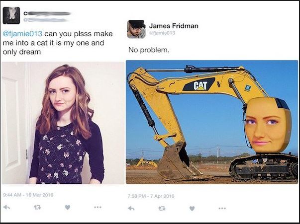 This is a piece of artwork made my James Fridman. James photoshops pictures of people from their consent and asks them to make something better of the picture. James Fridman follows their directions but he produces the different kinds of artwork in a more hilarious way. The thing that makes James good is the comedy he uses in his artwork. In the photo, the user asks to be a CAT, but didn't specifically say what kind of cat thus making her a CAT bulldozer.
 This was a piece of artwork made by my brother Justin Luzano that won first place at the San Diego County Fair. As a reward, he recieved a ribbon which was an honor for him. In order to make this however, he looked online and followed the steps accordingly. The photo was taken during class and it is obvious that that hard work payed off.
|
AuthorJared Luzano loves to photoshop kids for fun at Bonita Vista High School. Archives
December 2017
Categories |
 RSS Feed
